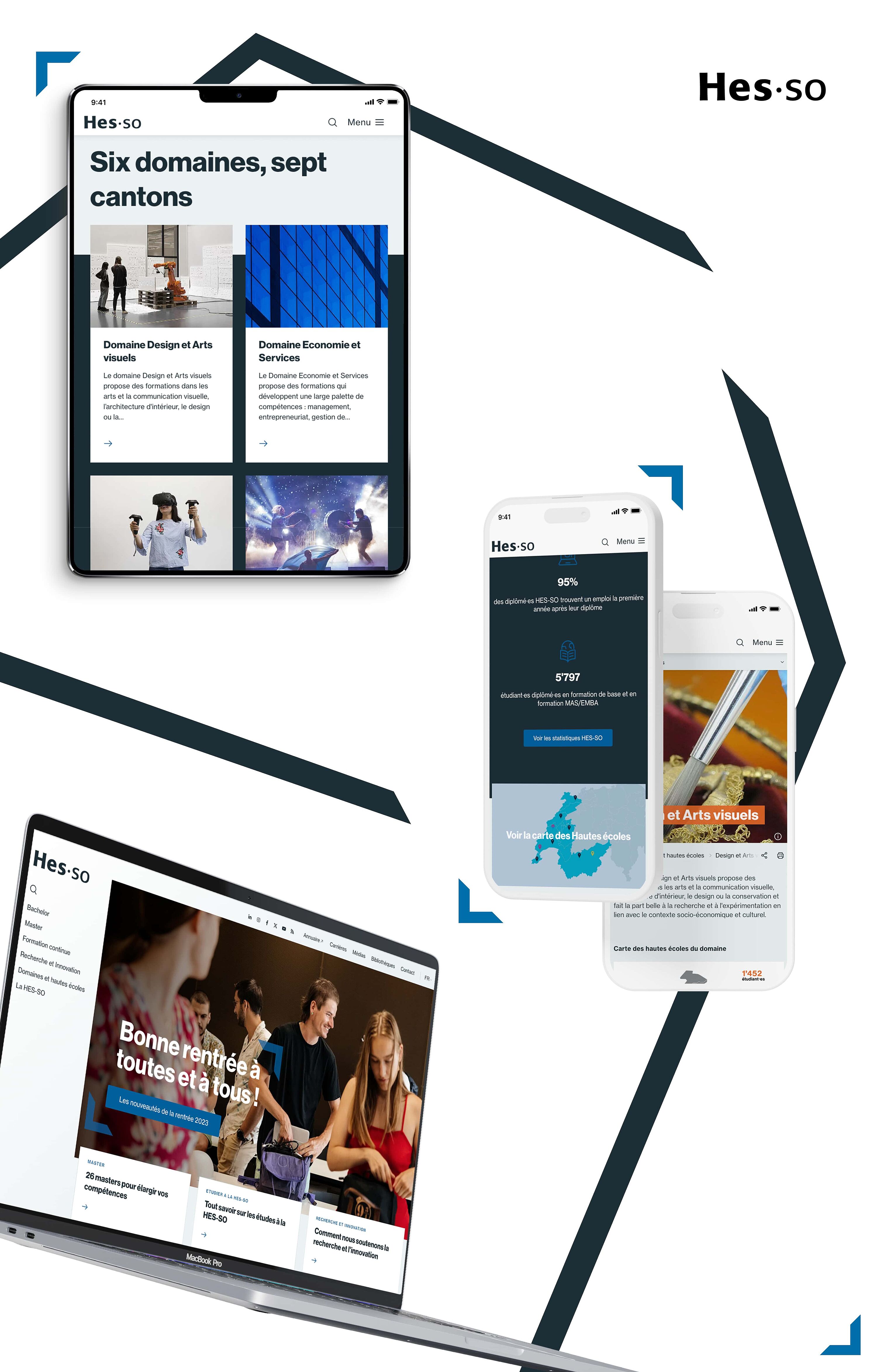
Following the launch of their new graphical, the HES-SO wanted to adapt its website, which we produced in 2021, to its new colours and style.
We took advantage of the opportunity to optimise the overall ergonomics, by lightening the menu with the addition of a top header, and that of the home page by condensing the news, diary and social networking sections with tabs. The aim was to make the user experience more efficient by keeping navigation as simple as possible.


