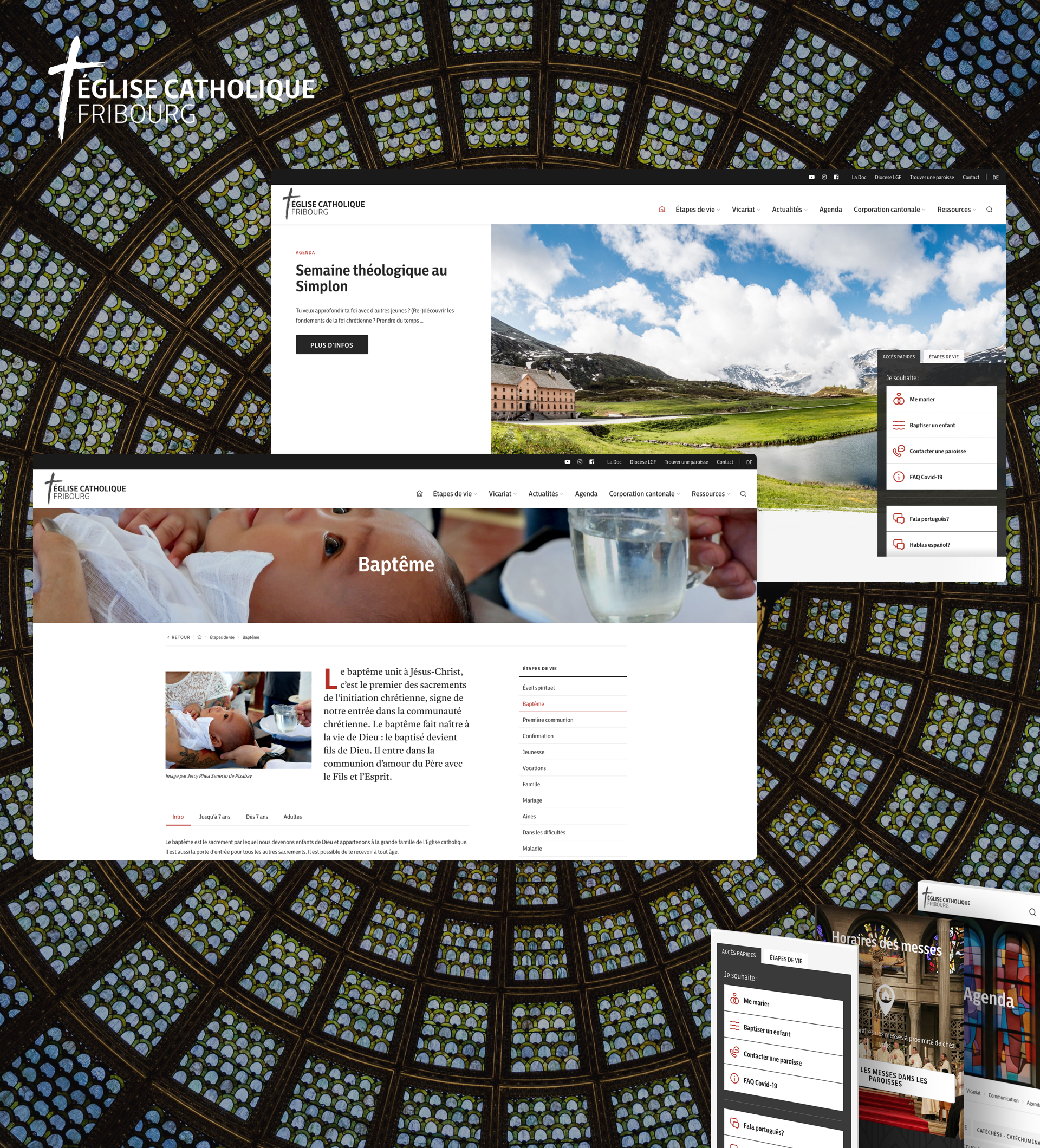
Here is how our agency overcame the various challenges encountered during the redesign of the website of the Catholic Church of the Canton of Fribourg on WordPress.
Visual identity
The client wanted to rethink its visual identity to match its new vision. Tanguy, our designer, created a clean and modern universe, revolving around the symbols linked to the Catholic Church of the canton of Fribourg.
Multilingual website
Knowing that Fribourg is a bilingual canton, our client wanted to meet the needs of each user likely to visit its site. More than just a simple French/German translation, the site was designed in two different ways in order to correspond to the sensibilities of each user.
Navigation by life stage
As each user visits the site for specific needs, our designer Tanguy and our developers Kilian and Romario, together imagined a navigation by life stage. Thus, the user wishing to organise his wedding or his child's baptism can quickly find the information he is looking for.
Presence on social networks
Our client needed our advice to increase its visibility on its social networks. In response, Alexia, our Digital Marketing Coordinator, drew up a Social Media Charter defining the tone to adopt, the best practices to follow, the hashtags to use, the frequency of publication to adopt and the types of content to produce.


